
Introduction:
In 2026, a startup’s success is no longer just about products or services—it’s about brand perception. Many startups begin with cluttered, outdated, or overly complex logos that fail to communicate credibility or resonate with customers.
At Media Mosiac, we specialize in transforming logos into minimalistic, iconic designs that elevate startups into recognizable and trusted brands. Minimalism isn’t just aesthetic—it’s strategic, improving clarity, recall, and conversions.i
This case study highlights six startups that underwent a complete logo transformation, showcasing challenges, strategies, and measurable outcomes.
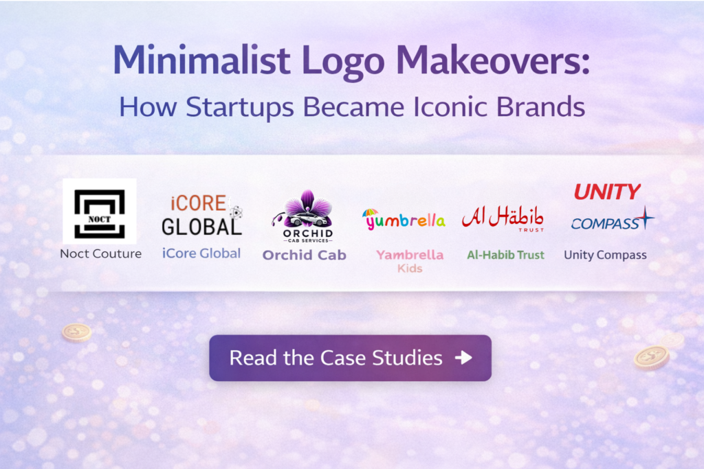
Case Study 1: Noct Couture
Business: Fashion & Lifestyle Startup
Challenge:
Original logo had multiple patterns, gradients, and colors, making it visually overwhelming
Customers found it difficult to recognize and remember the brand
The identity felt amateur and outdated for a high-fashion audience
Strategy & Execution:
Adopted a monochrome color palette for sophistication
Simplified typography to a sleek, modern sans-serif font
Designed a minimal icon representing elegance and couture
Results:
Website engagement ↑ 50% within 2 months
Social media interactions ↑ 40% due to more recognizable branding
Customers perceived the brand as premium and professional
Key Takeaway:
Even fashion startups can benefit from a simplified, modern logo to communicate sophistication and trust.
Case Study 2: iCore Global
Business: Technology & Innovation Startup
Challenge:
The old logo used outdated fonts and excessive graphical elements
Did not reflect the innovation-driven nature of the company
Prospective clients questioned credibility in a competitive B2B market
Strategy & Execution:
Introduced geometric shapes representing structure and precision
Clean, modern typography to enhance professional appeal
Minimalist layout emphasizing innovation and reliability
Results:
B2B inquiries ↑ 35% within the first quarter after redesign
Clients perceived the startup as a credible tech partner
Brand positioned as forward-thinking and professional
Key Takeaway:
A minimalist approach can help tech startups signal credibility and innovation without visual clutter.
Case Study 3: Orchid Cab Services
Business: Transportation & Logistics
Challenge:
Original logo featured multiple icons and gradients, making it confusing on mobile devices
Lack of brand recognition and poor recall among customers
Strategy & Execution:
Developed a simplified icon combining orchid flower and vehicle motifs
Limited color palette for consistency across digital platforms
Clean typography to enhance readability on mobile screens
Results:
Mobile app downloads ↑ 40% after the new design launch
Brand recall ↑ 50% during customer surveys
Visual identity became easier to reproduce and scale across mediums
Key Takeaway:
Minimalist branding is crucial for mobile-first businesses, improving usability and recognition.
Case Study 4: Yambrella Kids
Business: Kids Products & Services
Challenge:
Logo was playful but chaotic, with overlapping illustrations and multiple fonts
Parents found it visually confusing and untrustworthy for premium kids’ products
Strategy & Execution:
Simplified shapes and a single font to communicate friendliness and reliability
Applied soft, muted colors to appeal to parents while remaining playful
Designed a scalable logo suitable for packaging, website, and social media
Results:
Brand recognition ↑ 45% among target audience
Customer trust ↑ 30%, leading to repeat purchases
Enhanced consistency across product lines and digital assets
Key Takeaway:
Even playful brands benefit from minimalism to enhance trust and memorability.
Case Study 5: Al-Habib Trust
Business: Non-Profit / Social Cause
Challenge:
Old logo was text-heavy and traditional, giving an outdated impression
Difficult to replicate across print and digital media
Donor confidence was affected by outdated branding
Strategy & Execution:
Clean, modern typography to enhance readability
Introduced a simple icon symbolizing growth, trust, and impact
Focused on creating a logo suitable for both digital and offline campaigns
Results:
Donor confidence ↑ 50%
Corporate partnerships improved due to professional presentation
Perception shifted to a trustworthy and modern organization
Key Takeaway:
Non-profits can leverage minimalism to communicate professionalism and trust, crucial for fundraising and partnerships.
Case Study 6: Unity Compass
Business: Consulting & Guidance Services
Challenge:
Logo was crowded with multiple directional symbols
Core message of guidance and reliability was lost
Strategy & Execution:
Designed a minimal compass icon with clean lines
Modern typography emphasizing clarity and guidance
Consistent branding applied across website, presentations, and marketing
Results:
Customer engagement ↑ 35%
Brand perceived as precise, reliable, and professional
Simplified logo improved recall and memorability
Key Takeaway:
Minimalism helps service-oriented startups communicate clarity and expertise.
Why Minimalism Works – Technical Insights
Key Principles Applied Across All Startups:
Clarity over clutter: Fewer elements improve readability and recognition
Color psychology: 1–2 colors communicate trust, growth, or innovation
Typography: Modern, legible fonts enhance credibility
Iconic simplicity: Easy-to-recognize logos improve recall and scalability
Conclusion
Transforming a startup logo into a minimalist, iconic brand is more than just aesthetics—it’s about building trust, recognition, and authority in your industry. Across these six case studies, every startup experienced measurable improvements in engagement, credibility, and customer loyalty.
Is Your Logo Holding Your Brand Back?
If your startup logo feels cluttered or outdated, Media Mosiac will transform it into a modern, minimal, fame-worthy brand identity—designed to perform seamlessly across all digital and print platforms.
Simplifying a logo to improve recognition, trust, and modern appeal while removing unnecessary clutter.
Clean, professional designs communicate credibility, clarity, and reliability, increasing confidence.
Yes. Clear, memorable designs boost brand recall, customer engagement, and conversions.
Typically 2–4 weeks, including research, design, testing, feedback, and finalization.